Food Carbon & Nutrition Data
Visualization 1: CO₂ Emissions by Food Item
This bar chart ranks all 38 food items from highest to lowest CO₂-equivalent emissions per kilogram of food produced. Animal proteins — especially beef, lamb, and prawns — dominate the upper end of the scale, while fruits and vegetables cluster near zero.
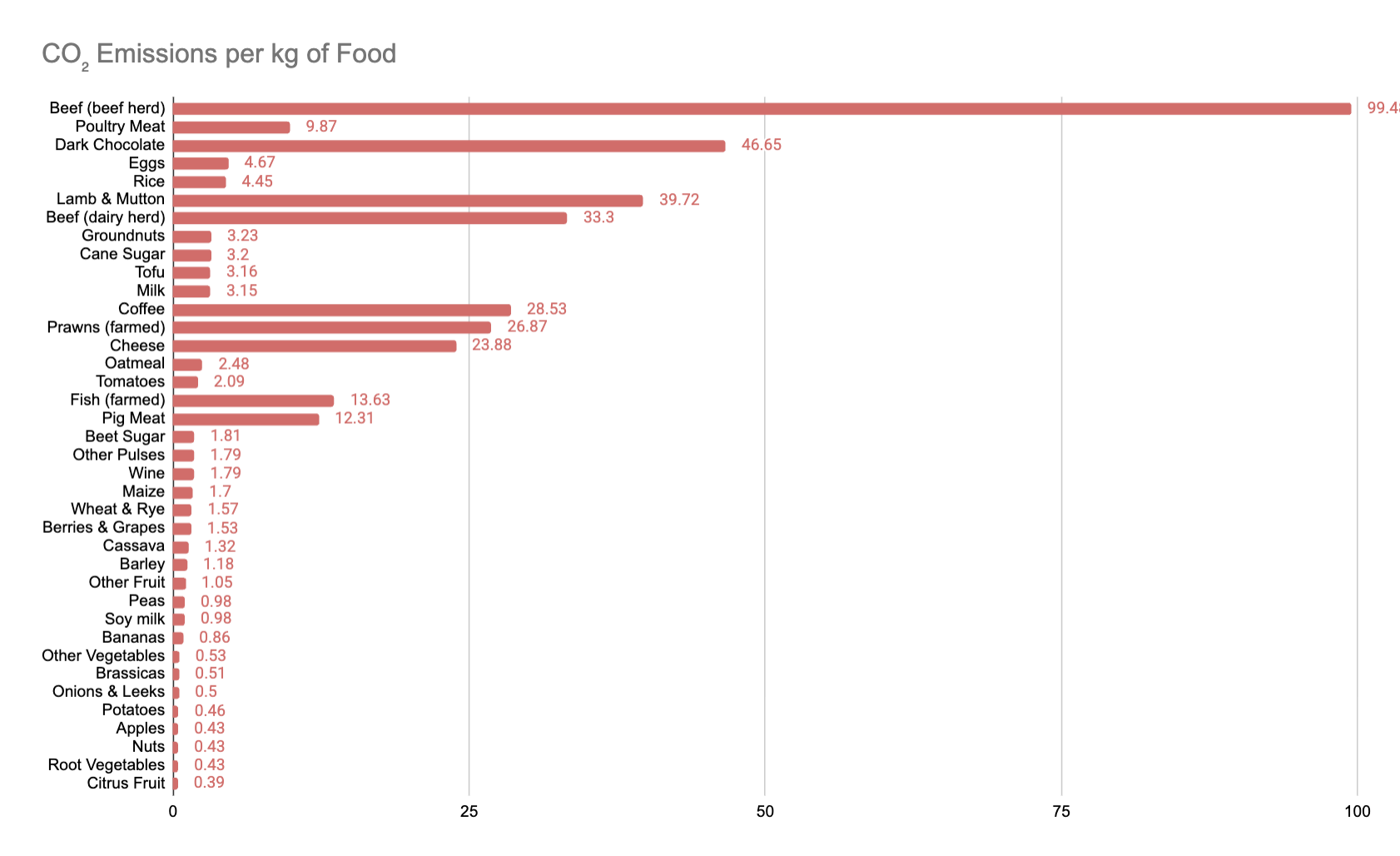
Figure 1: CO₂eq (kg per kg of food), sorted highest to lowest. Source: Our World in Data.
Visualization 2: Carbon Cost vs. Protein Content
This scatter plot compares each food's CO₂ emissions (Y axis) against its protein content per 100g (X axis). Foods in the lower-right quadrant are most efficient — high protein with low emissions. Tofu and pulses stand out as strong performers, while beef and lamb sit in the high-emission, moderate-protein zone.
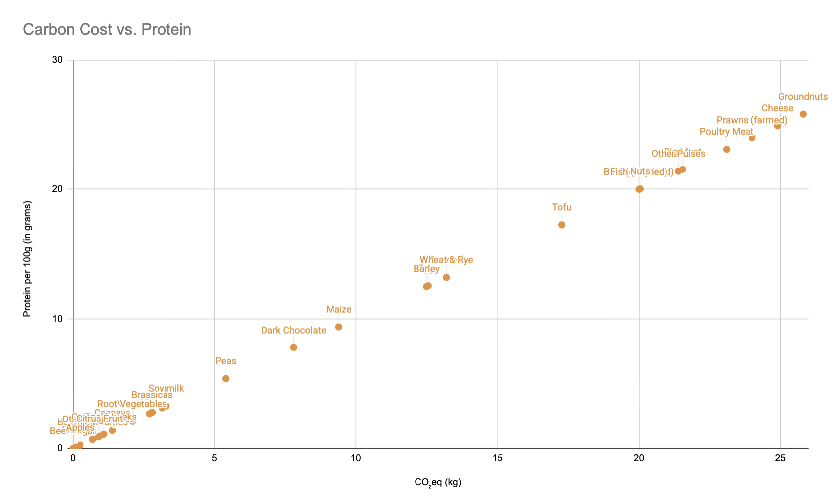
Figure 2: CO₂eq (kg/kg) vs. Protein (g/100g). Source: Our World in Data & USDA FoodData Central.